A dashboard is not a report. A report is a static document you send to someone who will not read it. A dashboard is a live diagnostic tool meant to surface failure. The typical approach involves connecting a BI tool directly to a production database, pulling some charts together, and calling it a day. That method is fragile, slow, and a security risk waiting to happen.
True metric automation has nothing to do with the final visual layer. It is about building a durable, verifiable data pipeline. The dashboard is just the terminal that displays the output. The real engineering happens in the plumbing, where raw, chaotic data is stripped, shaped, and forced into a structure that has meaning. Most teams get this backward and spend their time fighting broken charts instead of building a solid data foundation.
Step 1: Audit Your Data Sources Before Writing a Single Line of Code
Your dashboard is only as reliable as its weakest data source. Before you think about visualizations, you must rigorously audit every API, database, and log file you intend to pull from. Map out every endpoint. Check the documentation for rate limits, authentication methods, and data schemas. Assume the documentation is outdated and verify every field yourself.
Running `curl` against an endpoint is not an audit. You need to understand its behavior under load and during off-peak hours.
API Endpoints
Most of your critical SaaS tools expose a REST or GraphQL API. For each one, determine the cost of a call. This cost is measured in latency, rate limits, and sometimes actual dollars per thousand calls. A sluggish API will become the bottleneck for your entire pipeline. If an API has a hard limit of 100 requests per minute, you cannot design a system that needs to pull 120 times per minute. It is a simple constraint that dictates your entire extraction strategy.
You must also identify the authentication method. OAuth2 is common but requires a token refresh flow that you must build into your extraction scripts. A simple API key is easier but less secure. Document this for every single source.
Database Connections
Querying a production database directly for analytics is a fireable offense in a competent organization. The load from analytical queries, often involving full table scans and complex joins, can degrade application performance for actual users. The correct approach is to target a read replica or a dedicated data warehouse. This isolates the analytical workload from the operational one.
Establish the connection credentials, firewall rules, and user permissions required. Your pipeline should have the absolute minimum permissions necessary, typically read-only access to specific tables or views. Do not use a root database user. That is how you end up in a post-mortem at 3 AM.
Step 2: Engineer the ETL Pipeline
The Extract, Transform, Load (ETL) process is the engine of your automation. This is where 90% of the work is. It is unglamorous, tedious, and absolutely critical. This system will run on a schedule, fetching raw data, cleaning it, and loading it into a central location for the dashboard to query.
Extract: Pulling the Raw Data
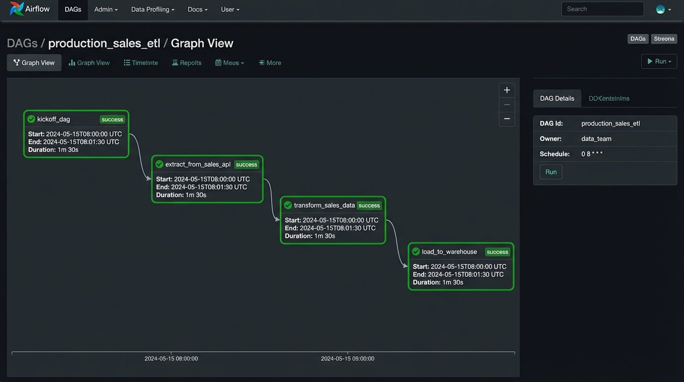
The extraction phase is about fetching data from the sources you audited. This is typically done with scripts scheduled to run at regular intervals. A simple cron job can run a Python script, but for anything complex with dependencies, you need an orchestrator like Apache Airflow or Prefect. Orchestrators handle retries, logging, and alerting when a job fails.
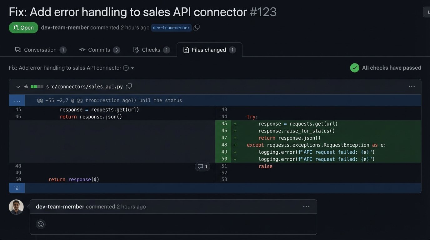
Your extraction scripts must be resilient. APIs will return 503 errors. Network connections will drop. The script must handle these exceptions gracefully, log the error, and retry according to a defined policy. A script that crashes on the first failure is a useless script.
Here is a basic Python example using the `requests` library to pull data from a hypothetical API, including basic error handling.
import requests

import time

import os
API_KEY = os.getenv("SALES_API_KEY")
ENDPOINT = "https://api.example.com/v1/sales"
HEADERS = {"Authorization": f"Bearer {API_KEY}"}
def fetch_sales_data(date_str):
params = {"date": date_str}
max_retries = 3
retry_delay = 5 # seconds
for attempt in range(max_retries):
try:
response = requests.get(ENDPOINT, headers=HEADERS, params=params, timeout=10)
response.raise_for_status() # Raises an HTTPError for bad responses (4xx or 5xx)
return response.json()
except requests.exceptions.RequestException as e:
print(f"Attempt {attempt + 1} failed: {e}")
if attempt < max_retries - 1:
time.sleep(retry_delay)
else:
print("Max retries reached. Failing.")
return None
# Usage
sales_data = fetch_sales_data("2023-10-26")
if sales_data:
# Proceed to the transform step
print(f"Successfully fetched {len(sales_data)} records.")
This script is a starting point. It does not handle pagination, which is a critical feature of most APIs that return lists of objects.
Transform: Shaping the Data
Raw data from an API is almost never in the format you need. It contains nested objects, inconsistent naming conventions, and extraneous fields. The transform step is where you impose order. You strip away useless information, flatten nested structures, rename fields for clarity, and join data from different sources.
This is where business logic lives. For example, you might pull user session data from one source and transaction data from another. The transform logic would join these two datasets on a user ID to calculate a conversion rate. This derivative metric does not exist in any source system; you create it here. Using a library like Pandas in Python is standard practice for this kind of in-memory data manipulation.
Load: Storing the Cleaned Data
The transformed data needs a permanent home. Loading it into a data warehouse like Google BigQuery, Amazon Redshift, or Snowflake is the industry standard. These systems are columnar databases optimized for fast analytical queries over large datasets. They separate storage from compute, allowing you to scale each independently. They are also wallet-drainers if you are not disciplined about query construction and data partitioning.
For smaller projects, a simple PostgreSQL database can work as a data mart. It is cheaper and easier to manage but you will eventually hit a performance ceiling. The load step involves connecting to the target warehouse and inserting or updating the transformed data. SQL `MERGE` or `UPSERT` commands are common here to handle new and existing records without creating duplicates.
Step 3: Connect the Dashboarding Tool
Only now do you touch the dashboarding software. Whether you use Grafana, Looker, Tableau, or something else, its job is to query the clean, structured data in your warehouse. It should not be performing heavy transformations or complex joins. All that work should already be done.
Configuring the Data Source
The first action is to establish a connection from the BI tool to your data warehouse. This involves providing credentials, hostnames, and database names. Again, use a dedicated, read-only user for the dashboard tool. This prevents a vulnerability in the dashboarding software from becoming a data breach in your warehouse.
Grafana is excellent for time-series data and operational metrics, making it a strong choice for monitoring infrastructure health, application performance, or real-time sales data. Looker forces discipline through its LookML semantic layer, which defines all your metrics and their relationships in code. This makes governance easier but introduces a steep learning curve. Tableau offers the most flexibility for ad-hoc analysis and complex visualizations, but that flexibility can lead to a chaotic environment of inconsistent, unmanaged dashboards if not governed properly.
Step 4: Design Visualizations That Surface Anomalies
A good dashboard does not just show you numbers. It shows you when a number is wrong. Avoid vanity metrics like total user signups. Instead, track the week-over-week percentage change in signups. That delta is what matters. Use visualizations that highlight change and deviation.
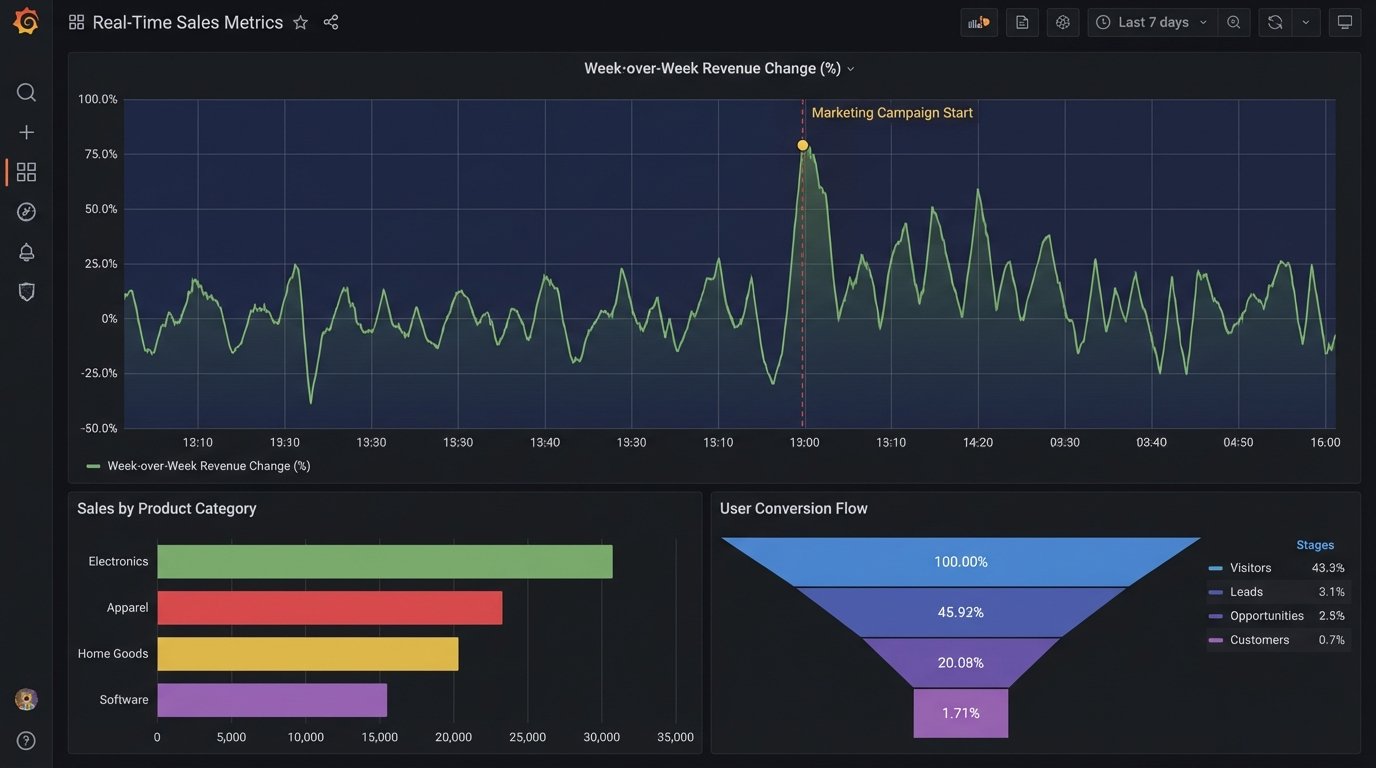
Time-series line charts are fundamental. They should have clear axes, annotations for important events like deployments or marketing campaigns, and configurable alert thresholds. When a metric crosses a threshold, the system should trigger an alert. The dashboard's purpose is to draw your attention to a problem, not to be a passive screen of green numbers.
Bar charts are good for comparing discrete categories, like revenue by product line. Funnel analysis charts are essential for tracking user progression through a flow, like from landing page to purchase. The goal is to choose the visualization that most directly answers a specific operational question. A pie chart rarely answers any question well.
Step 5: Implement Rigorous Validation and Health Checks
Your dashboard is now live and displaying numbers. You cannot trust them yet. You must build parallel processes to validate the data integrity from end to end. The entire pipeline, from data source to visualization, is like trying to shove a firehose of raw information through the needle of a single, validated metric. The process requires immense pressure and constant filtering to ensure only the truth gets through.
Data Reconciliation
Write a separate script that queries the source API directly and compares its results to what is stored in your data warehouse for the same time period. For example, query the sales API for yesterday's total revenue and compare it to the result of `SELECT SUM(revenue) FROM sales WHERE date = 'yesterday'` in your warehouse. These numbers should match exactly. If they do not, there is a bug in your ETL logic. Run this reconciliation check daily.
Staleness Monitoring
The data on your dashboard must be fresh to be useful. Every table in your warehouse that powers a dashboard should have a `last_updated_at` timestamp column. You can then build a specific panel on the dashboard itself that displays the maximum value of this column. If that timestamp is more than a few hours old, it means your ETL pipeline is broken or delayed. You can configure an alert on this panel to notify you of stale data.
A simple SQL query for this check looks like this:
SELECT

    MAX(last_updated_at) AS data_freshness

FROM

    your_aggregated_table;
Feed this into a "Stat" panel in Grafana and set a color threshold. Green if fresh, red if stale.
Step 6: Plan for Maintenance and Failure
This system is not a project you finish. It is a product you maintain. APIs will have breaking changes. Database schemas will drift. The automation you built will fail, and you must design it with that failure in mind. Version control is non-negotiable. All your ETL scripts, SQL queries, and dashboard configurations (as JSON models if possible) must live in a Git repository.
Implement comprehensive logging in your ETL scripts. When a script fails, the logs should provide a clear traceback and context about what data it was processing. These logs should be shipped to a centralized logging platform like Datadog or an ELK stack. Configure alerts based on log events. A script failing silently is the worst possible outcome.
An automated dashboard is not a shortcut. It is a commitment to engineering discipline. It forces you to treat your metrics with the same rigor as your production application code. The payoff is not a pretty chart. It is a single source of truth that the entire organization can trust because it has been programmatically verified, not just manually inspected.