Stop Dumping CSVs. Let’s Build a Real Estate Dashboard.
Every real estate operation sits on a mountain of disjointed data. Your CRM tracks leads with one set of property IDs. Your MLS feed dumps FTP files with another. Your transaction management system has its own schema entirely. The default solution is exporting CSVs and forcing some poor analyst to stitch them together in Excel, a process that is both error-prone and a spectacular waste of time.
Google Data Studio is presented as a simple drag-and-drop solution. It is not. Connecting it directly to your production data sources is a direct path to slow, unreliable, and incorrect dashboards. We will not be doing that. Instead, we will architect a proper staging layer in Google BigQuery to aggregate and clean the data before it ever touches a chart. This is the only way to build a reporting tool that doesn’t fall over when someone asks a hard question.
This is not a beginner’s guide. This is a blueprint for building an automated reporting system that survives contact with reality.
Prerequisites: The Data Staging Ground
Before you even open Data Studio, you need a centralized, structured warehouse. Connecting directly to a dozen different APIs and Google Sheets is like trying to build a house on quicksand. The performance will be awful, and a single API change will break your entire reporting stack. We use Google BigQuery as our staging ground. It’s built for this kind of work, and its native connector to Data Studio is fast.
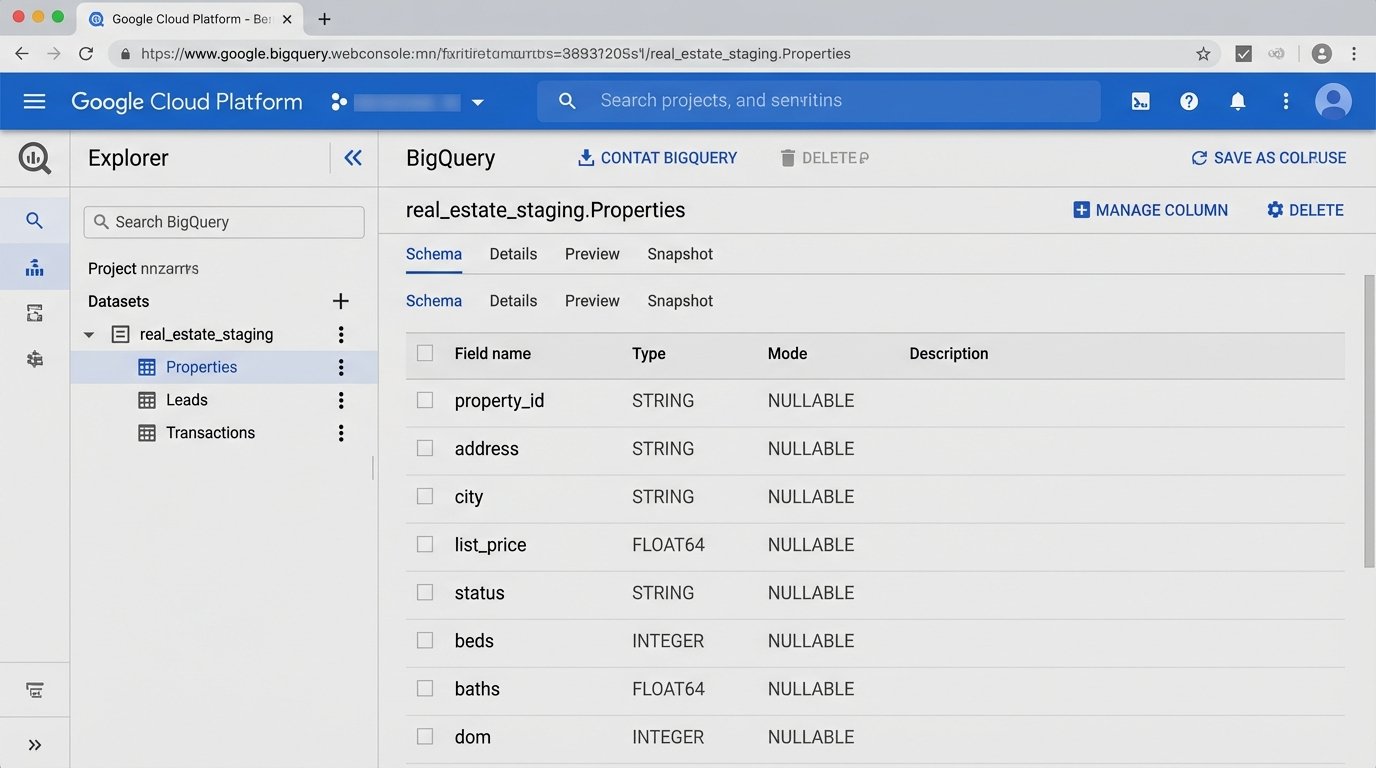
Your first job is to define a schema. Don’t just dump raw data into BigQuery. Think about the final report. What questions will be asked? For real estate, you typically need at least three core tables:
- Properties: One row per property. It should contain static data like address, beds, baths, square footage, and dynamic data like status (Active, Pending, Sold), list price, and DOM (Days on Market).
- Leads: One row per inquiry. This needs a timestamp, source (Zillow, Realtor.com, Direct), assigned agent, and a foreign key linking back to the property ID.
- Transactions: One row per closed deal. This holds the final sale price, closing date, agent commissions, and keys linking to both the agent and the property.
Trying to blend data directly from a CRM and an MLS feed in Data Studio is like trying to weld aluminum to wood. You need a proper joinery, which in our case is these structured BigQuery tables. The goal is to perform all the heavy logic-checking and data transformation here, not in the dashboard tool.
Step 1: Data Ingestion and Transformation
Getting data into BigQuery is the first real engineering challenge. Your CRM might have a native connector through a service like Fivetran or you might have to script against its API. For ancient MLS systems that still use FTP drops, a Google Cloud Function triggered by a new file arrival in a Cloud Storage bucket is a common and effective pattern. The function can parse the file and inject new rows into your BigQuery `Properties` table.
Once the raw data lands, it needs to be cleaned. Real estate data is notoriously dirty. You will find addresses formatted ten different ways and prices entered as text strings. This is where you run SQL transformations to standardize the mess. This is not optional.
For example, you might have a raw data table called `raw_mls_listings` and you need to populate your clean `Properties` table. Your SQL script, which you can schedule to run in BigQuery, would handle the cleaning.
Example Transformation SQL
This script strips non-numeric characters from the price and standardizes the street address abbreviations. This is a simple example. A production script would have dozens of these rules.
INSERT INTO `your-project.your_dataset.Properties` (property_id, address, city, list_price, status)

SELECT

  mls_id AS property_id,

  INITCAP(

    REPLACE(

      REPLACE(

        REPLACE(raw_address, ' St.', ' Street'),

      ' Rd.', ' Road'),

    ' Ave.', ' Avenue')

  ) AS address,

  INITCAP(raw_city) AS city,

  CAST(REGEXP_REPLACE(raw_list_price, r'[^0-9.]', '') AS FLOAT64) AS list_price,

  raw_status AS status

FROM `your-project.your_dataset.raw_mls_listings`

WHERE raw_list_price IS NOT NULL;
Running this kind of transformation inside BigQuery is cheap and fast. Trying to do it with a calculated field in Data Studio for every chart load is a wallet-drainer.
Step 2: Connecting BigQuery to Data Studio
This is the simplest step, which is why people try to jump to it first. Inside Data Studio, create a new data source and select the BigQuery connector. Authenticate with your Google account. You will see a list of your projects, datasets, and tables. Select the clean `Properties` table you created.
You face a critical choice here: Live Connection or Extract. A live connection queries BigQuery every time a user changes a filter or refreshes the page. An extract pulls the data into Data Studio’s in-memory engine (called BI Engine) on a schedule. For 95% of real estate dashboards, an extract updated every hour is the correct choice. It results in a dashboard that is orders of magnitude faster for the end user.
Using a live BigQuery connection for a complex dashboard is like running a database query for every mouse click. It’s a great way to watch your cloud bill turn into a house payment. Only use a live connection if you have a genuine need for up-to-the-second data and have architected your queries to be hyper-efficient.
Once connected, Data Studio will try to guess the data type for each field. Double-check its work. Make sure your price fields are `Currency`, dates are `Date`, and geographic data like addresses or ZIP codes are set to their corresponding `Geo` types.
Step 3: Building Core Real Estate Visualizations
With a clean data source, building charts is straightforward. Focus on answering specific business questions, not just displaying data.
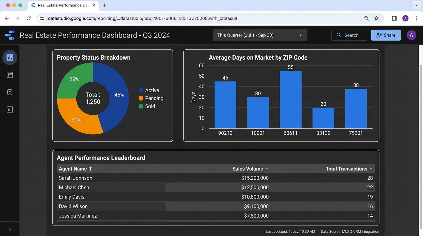
- Property Status Overview: Use a pie chart or bar chart to show the count of properties by status (Active, Pending, Sold). This gives a high-level view of inventory.
- Days on Market (DOM) by ZIP Code: A bar chart showing the average DOM for sold properties, grouped by ZIP code. This immediately highlights hot and cold markets. The metric for this would be an `AVG(dom)`.
- Agent Performance Leaderboard: A simple table is best. Show agent names, with columns for `COUNT(sold_properties)`, `SUM(sale_volume)`, and `AVG(list_price_vs_sold_price_delta)`. This usually sparks some “healthy” competition.
- Lead Source Effectiveness: Use a map visualization. Plot leads as dots on a map, color-coded by source (Zillow, Realtor.com, etc.). This helps visualize where marketing spend is generating results.
The key is to start with these foundational charts. Each one should be tied to a key performance indicator for the business. A dashboard full of vanity metrics is useless.
Step 4: Blending Data Sources for Deeper Insight
The real power comes from connecting your separate, clean tables. For instance, you want to know which properties are generating the most leads. This requires blending your `Properties` data source with your `Leads` data source inside Data Studio.
Select two charts, one from each data source, then right-click and choose “Blend data.” Data Studio will open a new interface. Here, you define the join key. This must be a field that exists in both tables, like `property_id`. You’ll configure a LEFT JOIN, with `Properties` as the left table and `Leads` as the right. This ensures all properties are shown, even those with zero leads.
The output is a new, blended data source. You can now build a table that shows a property’s address (from the `Properties` source) alongside a `COUNT(lead_id)` (from the `Leads` source). This is impossible without the staging layer and a common key.
Be warned: blending kills performance. Every blend adds complexity and slows down rendering. Use it sparingly for specific, high-value insights. Do not build an entire dashboard from a single, monstrously complex blend.
Step 5: Calculated Fields for On-the-Fly Metrics
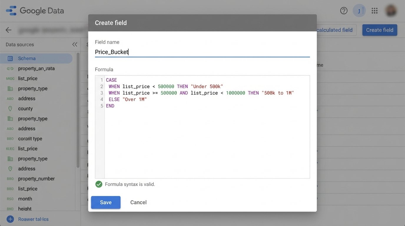
Sometimes you need to derive a metric that doesn’t exist in your database. Data Studio’s calculated fields are useful for simple arithmetic or text manipulation. For example, you can create a field called `Commission_Est` on your `Transactions` data source.
The formula would be `Sale_Price * 0.025`. This is fine for simple math. You can also use conditional logic with CASE statements. For example, you can group properties into price buckets.
CASE

    WHEN list_price < 500000 THEN "Under 500k"
    WHEN list_price >= 500000 AND list_price < 1000000 THEN "500k to 1M"
    ELSE "Over 1M"
END
A calculated field in Data Studio is just a thin veneer of logic. If your underlying data has nulls or incorrect types, it’s like putting fresh paint on a rotten wall. The problem is still there. For any complex logic, especially logic that needs to be used across multiple reports, push it down into a SQL view in BigQuery. Centralize your business logic in the data layer, not the presentation layer.
Step 6: Validation and Governance
Your dashboard is wrong until you prove it is right. Never deploy a dashboard without rigorously validating the numbers against the source systems. Pick five random "Sold" properties from the last month. Manually look them up in your CRM or transaction system. Does the sale price match? Is the agent correct? Is the closing date identical?
Create a checklist:
- Row Counts: Does the total number of active listings in the dashboard match the total in the MLS for today?
- Financial Totals: Does the total sales volume for the quarter in your dashboard match the number from the accounting department's report? They will be the first to call you out if it's wrong.
- Drill-Down Consistency: Filter for a single agent. Do their individual stats on the leaderboard match a manual report run just for them?
Finding a discrepancy is not a failure. It is a success, because you found it before the CEO did. The issue is almost always in the ingestion or transformation logic, not in Data Studio itself.
Finally, consider data freshness. Your dashboard is only as good as its last refresh. If you are using an extract, the data is inherently latent. Make sure you add a small text box somewhere visible on the report that says "Data last updated:" and connect it to the `Last Updated` field. This manages expectations and prevents people from making decisions based on stale data.
A dashboard is not a project you finish. It is a system you maintain. The underlying APIs will change, data schemas will drift, and user requests will evolve. The architecture we have laid out, with a central staging layer in BigQuery, is designed to handle that change without requiring a full rebuild every six months.