
The Signal Was Buried Under Manual Reporting Hell
The problem wasn’t a lack of data. The problem was that our data lived in isolated, warring kingdoms. Marketing had Google Analytics 4. Sales lived and died by Salesforce. Product Engineering had their precious PostgreSQL database tracking every feature click. Every month, a junior analyst would spend a week exporting three different CSVs and trying to force them to talk to each other in a spreadsheet that would crash a decent gaming rig.
This manual process was more than just a time-sink. It was a business intelligence black hole. We were making six-figure decisions based on three-week-old data that had been manually scrubbed, stitched, and statistically tortured into something resembling a trend line. We were blind, and we knew it. The breaking point came when a competitor launched a feature that directly targeted a user behavior we had completely missed. The data for it was sitting right there, fragmented across our systems. We just couldn’t connect the dots in time.
Our goal was simple in theory, but a nightmare in practice. We needed to fuse user engagement data from our web analytics with lead qualification data from our CRM and actual in-app feature usage from our production database. The old way was a guaranteed failure. We had to automate the entire pipeline, from data extraction to final visualization, or risk becoming irrelevant.
Architecture of the Data Bridge
We rejected off-the-shelf ETL platforms. Most were wallet-drainers, charging us per row or per connection, and their black-box nature meant we couldn’t control the logic when an API inevitably changed without warning. The decision was made to build a lean, in-house solution using Python, a cloud scheduler, and Google BigQuery as our central data warehouse. This gave us total control over the logic and kept operational costs minimal.
The architecture breaks down into three core stages: Extraction, Loading, and Transformation (ELT, not ETL, a critical distinction). We pull raw, unfiltered data into the warehouse first. Transformation happens later, within BigQuery itself. This approach is faster and more flexible. If we need to change a business logic rule, we just rewrite a SQL view instead of re-running the entire, sluggish extraction pipeline for historical data. It’s the difference between remodeling a room and bulldozing the entire house to move a single wall.
Stage 1: The Extraction Scripts
We built three separate Python scripts, one for each data source, designed to be executed by a simple cron job on a Google Cloud Function. Keeping them separate prevents a failure in one script from torpedoing the entire run.
Google Analytics 4 (GA4): The GA4 Data API is notoriously finicky, with tight quotas that seem designed to punish you for asking too many questions at once. We used the official Google API Python client library. The script pulls key dimensions and metrics: page path, session source, user counts, and custom event triggers related to content downloads. The main challenge was implementing a proper exponential backoff retry mechanism to handle the inevitable rate-limiting errors without just falling over.
# Simplified Python snippet for GA4 data extraction

from google.analytics.data_v1beta import BetaAnalyticsDataClient

from google.analytics.data_v1beta.types import RunReportRequest
def get_ga4_data(property_id):
client = BetaAnalyticsDataClient()
request = RunReportRequest(
property=f"properties/{property_id}",
dimensions=[{"name": "pagePath"}, {"name": "sessionSource"}],
metrics=[{"name": "activeUsers"}, {"name": "sessions"}],
date_ranges=[{"start_date": "yesterday", "end_date": "today"}],
limit=100000
)
# Error handling and pagination logic stripped for brevity
response = client.run_report(request)
return response
This code pulls the raw data. It does no filtering or cleaning. Its only job is to get the data out and prepare it for loading.
Salesforce: Getting data from Salesforce was more straightforward. We used the `simple-salesforce` Python library, which abstracts away a lot of the SOAP and REST API misery. We focused on the `Lead` and `Contact` objects, pulling fields related to lead source, industry, company size, and current status. The key piece of data we needed to grab was the user’s email address, which would serve as our primary join key.
PostgreSQL Product Database: This was the easiest part. A direct `psycopg2` connection to a read-replica of our production database. We wrote a simple SQL query to dump a daily snapshot of a `feature_usage` table. This table logged `user_id` and `feature_name` every time a user interacted with a specific tool inside our application. The goal was to get this raw clickstream data without putting any load on the primary production database.
Stage 2: Loading into the Warehouse
Once the scripts extracted the data into memory as JSON or CSV formatted text, they piped it directly into Google Cloud Storage. From there, we configured a BigQuery Data Transfer Service job. This service automatically watches a specific storage bucket and loads any new file into a corresponding raw data table in BigQuery. This decouples the extraction from the loading. The Python script’s only job is to dump a file. It doesn’t need to know anything about BigQuery’s schema or API. It’s a fire-and-forget operation, which makes it incredibly resilient.
Trying to join GA4’s client ID with Salesforce’s email without a reliable bridge is like trying to map a city using two different maps, one in English and one in Mandarin, with no translation key. You need a common identifier. We forced this identifier by injecting the Salesforce contact ID into our application’s data layer, which then passed it to GA4 as a custom user dimension. This was the linchpin that held the entire system together.
Stage 3: Transformation with SQL
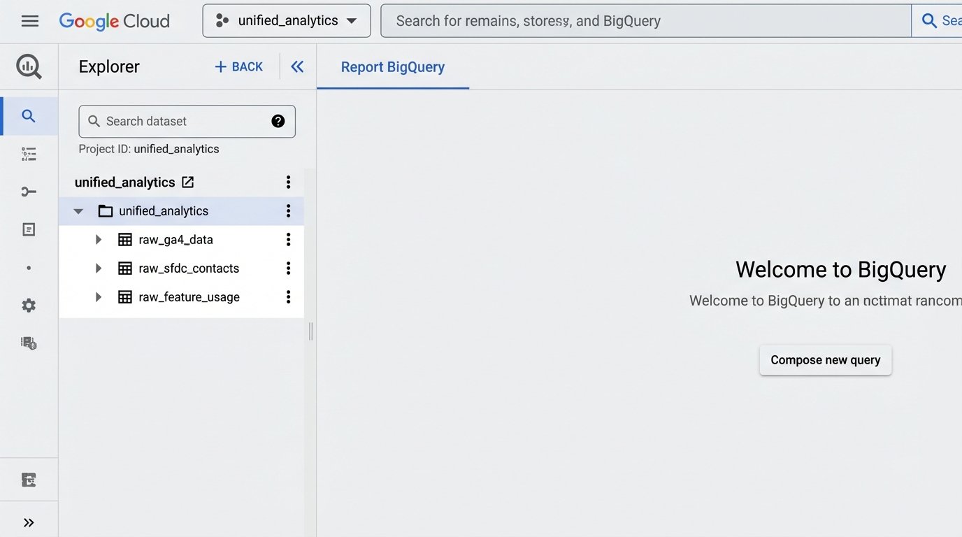
This is where the real work happens. Inside BigQuery, we have three tables with raw, messy data: `raw_ga4_data`, `raw_sfdc_contacts`, and `raw_feature_usage`. We didn’t touch these tables. Instead, we built a series of SQL views on top of them. This is a critical architectural choice. Views are just stored queries. They don’t store data themselves. This means our storage costs stay low, and if we need to fix a data cleaning mistake, we just update the `CREATE OR REPLACE VIEW` statement and the “cleaned” data is instantly corrected everywhere.
The primary view, which we called `view_unified_user_activity`, performed the heavy lifting. It joined the three raw tables together.
-- Simplified BigQuery SQL for the unified view

CREATE OR REPLACE VIEW `project.dataset.view_unified_user_activity` AS

SELECT

  sfdc.Email AS user_email,

  sfdc.Industry AS user_industry,

  sfdc.CompanySize AS company_size,

  ga.pagePath AS last_visited_page,

  ga.sessionSource AS acquisition_source,

  feat.feature_name AS last_used_feature,

  feat.event_timestamp AS feature_use_timestamp

FROM

  `project.dataset.raw_sfdc_contacts` AS sfdc

LEFT JOIN

  `project.dataset.cleaned_ga4_data` AS ga

ON

  sfdc.ga_client_id = ga.user_pseudo_id -- The critical join key

LEFT JOIN

  `project.dataset.raw_feature_usage` AS feat

ON

  sfdc.user_id_in_app = feat.user_id

WHERE

  sfdc.is_active_customer = TRUE;
This SQL query creates a single, logical table that marketing, sales, and product can all use. It connects a user’s industry and company size from Salesforce to the specific blog posts they read in GA4 and the exact features they use in our product. This unified view was the foundation for everything that followed.
The Discovery in the Data
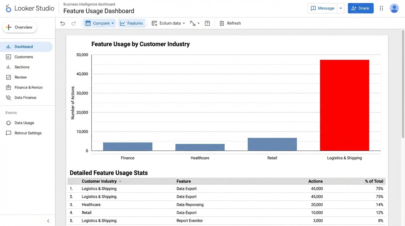
With the automated pipeline in place and data refreshing every 24 hours, we connected Google’s Looker Studio to our `view_unified_user_activity` view in BigQuery. For the first two weeks, we mostly confirmed things we already suspected. Sales-qualified leads from organic search used Feature X more often. Enterprise customers from the financial sector downloaded our security whitepaper. It was useful, but not groundbreaking.
The signal appeared in week three. A dashboard tracking feature usage by customer industry showed a strange spike. A minor feature, a data export tool we considered a low-priority utility, was seeing massive and repeated usage from a segment we barely marketed to: small businesses in the logistics and shipping sector. This segment made up less than 5% of our customer base, but they were responsible for 60% of all data exports. They were hammering this one button, day in and day out.
The old manual reporting system would never have caught this. It was too granular. We were always looking at macro trends, like total user growth or overall feature adoption. The manual process made it too painful to slice the data this finely. We would have missed the small industry segment and the outlier behavior. The automated system put it on a dashboard in bright red.
Validating the Trend
The data showed us the “what,” but not the “why.” Our product team immediately reached out to a dozen of these logistics customers. The conversations were identical. They weren’t using the export tool for archival purposes, as we had designed it. They were using it as a crude data bridge, exporting data from our system to manually upload it into their freight management software. They had created a clunky, manual workflow around our minor feature because they had a critical business need that nobody, including us, was addressing.
We had accidentally stumbled upon a new product category. There was a clear demand for a direct integration between our platform and the software used by the shipping industry. The raw data from the automated pipeline pointed the way, and a few customer calls confirmed the multi-million dollar opportunity.
Quantifiable Outcomes
The impact of this automated system went far beyond a single insight. The results were concrete and directly measurable.
- Reporting Time Reduction: The weekly manual reporting process that consumed roughly 10 hours of an analyst’s time was eliminated. This single automation freed up over 500 hours of skilled analyst time per year to focus on actual analysis instead of data janitorial work.
- Identified New Market Opportunity: The logistics industry integration became a top-line priority on our product roadmap. Projections based on the size of that market segment indicated a potential $2M to $3M ARR expansion opportunity over the next 24 months. This project would never have existed without the automated data pipeline.
- Increased Data Trust: With a single source of truth in BigQuery, arguments between departments about whose data was “correct” ceased. Marketing, Sales, and Product all worked from the same unified view, ending data silos and fostering actual collaboration. The dashboards were no longer questioned; they became the basis for strategic action.
Building this system wasn’t free. It took engineering resources to write the scripts and set up the cloud infrastructure. But the return on that investment was immediate and overwhelming. We stopped flying blind. We replaced gut-feel decisions with ones based on a daily feed of unified, reliable data. The system paid for itself the moment it uncovered that one hidden trend. Everything after that is pure profit.