
Every reporting tool, from Tableau to Looker Studio, ships with pre-built templates. They are designed to look impressive in a sales demo and fail spectacularly in a production environment. The core problem is that these templates are built on sanitized, generic datasets that bear no resemblance to the chaotic reality of Multiple Listing Service (MLS) feeds, CRM data, and lead generation APIs. They track “Users” and “Pageviews.” We track “Days on Market” and “Lead-to-Showing Conversion Rate.”
The goal isn’t to “use” the template. The goal is to gut it, strip it for parts, and rebuild its logic to reflect the actual mechanics of a real estate business. This requires bypassing the tool’s intended user-friendly workflows and injecting your own data architecture. If you’re just dragging and dropping the default widgets, you’re building a dashboard that’s not only useless but actively misleading. We have to force these systems to conform to our data, not the other way around.
Rip Out the Vanity Metrics. Start with the Data Source.
The first action is to delete every default chart built on metrics like “Bounce Rate” or “Session Duration.” These are noise. A real estate dashboard must answer specific financial questions. What is the average time from listing to pending? Which lead source generates the highest GCI? How many showings does it take to get an offer on a specific property type? The template knows none of this.
Your source of truth is the MLS API and your brokerage’s CRM. You must establish a direct data pipeline. Forget the tool’s native Google Analytics connector. We need to pull raw listing data, agent activity logs, and lead statuses directly. This means writing scripts to hammer APIs, deal with pagination, and handle the inevitable rate limits that throttle your data pulls in the middle of the night. The work isn’t in visualization. It’s in the unglamorous job of data extraction and cleaning.
This process is about creating your own metrics from raw components. For example, calculating “Average Days to Close” requires you to pull the listing date, the pending date, and the closing date. You then have to write a transform to calculate the deltas, handle null values for listings that haven’t closed, and aggregate the result. The template’s “Average Time on Page” metric is a joke in comparison.
Your reporting tool should be the last step, not the first. It’s a thin visualization layer on top of a data model you architected yourself.
Code Example: Calculating a Real Metric
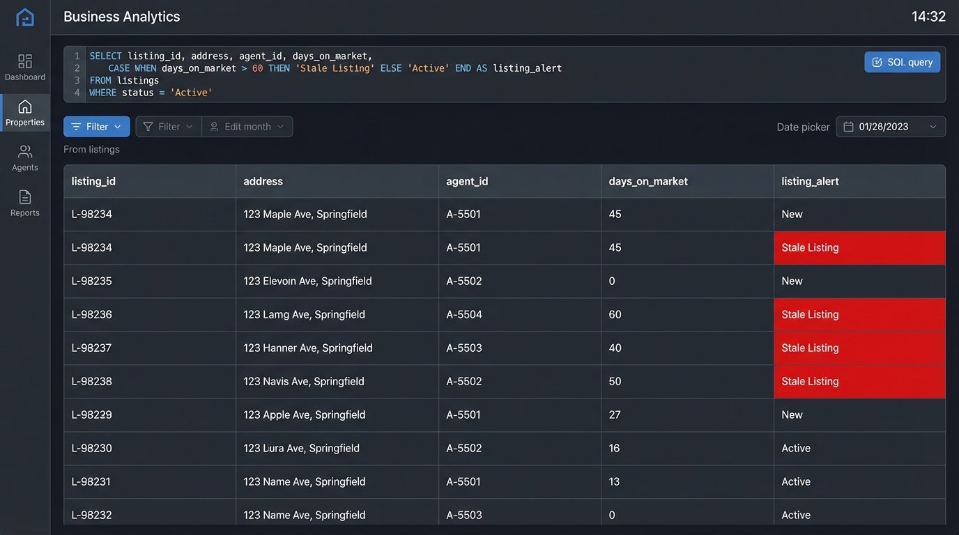
A template will never give you this. The following SQL logic is a simplified example of how you might calculate Days on Market (DOM) and flag listings that are dragging down your averages. This logic belongs in your data warehouse or a transformation step, long before the data ever touches the reporting tool’s interface.
SELECT

    listing_id,

    address,

    agent_id,

    listing_date,

    pending_date,

    status,

    CASE

        WHEN status = 'Active' THEN DATE_DIFF(CURRENT_DATE(), listing_date, DAY)

        WHEN status = 'Pending' OR status = 'Sold' THEN DATE_DIFF(pending_date, listing_date, DAY)

        ELSE 0

    END AS days_on_market,

    CASE

        WHEN status = 'Active' AND DATE_DIFF(CURRENT_DATE(), listing_date, DAY) > 90 THEN 'Stale Listing'

        ELSE 'Normal'

    END AS listing_alert

FROM

    mls_data

WHERE

    listing_date > '2023-01-01';
This query doesn’t just pull data. It creates new, meaningful fields like `days_on_market` and `listing_alert` that are specific to the real estate context.
Inject Logic for Dynamic Property Status
A property’s status is its most critical attribute: Active, Pending, Contingent, Sold, Withdrawn. A standard template might offer a simple pie chart to show the distribution. This is functionally useless. We need to see status as a living, changing variable that impacts everything else. This means using conditional formatting aggressively to make statuses visually scream for attention.
Sold properties should be one color, active another, and pending a third. Stale listings, those active for over 90 days, should be flagged in bright red. This isn’t done with the tool’s point-and-click color palette. It’s done by writing case statements or custom functions that apply formatting rules based on your data logic. You’re injecting rules directly into the reporting layer.
The performance cost here is real. Applying complex formatting rules across a dashboard with thousands of listings can make it sluggish. The system has to logic-check every single row on every refresh. The key is to pre-calculate as much of this status logic as possible in your data warehouse, so the reporting tool is just rendering a pre-defined category, not computing it on the fly.
Don’t trust the template to understand that “Pending” is a more urgent status than “Active.” You have to code that hierarchy yourself.
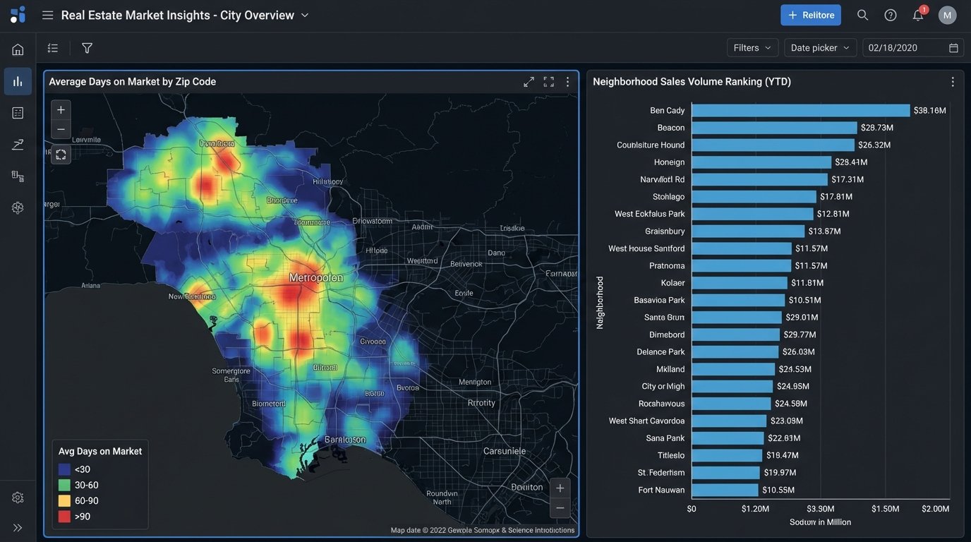
Bridge Geographic Data to Performance, Don’t Just Map It
Every reporting template has a map widget. Most of the time, it’s a gimmick that shows dots on a map. For real estate, a map is a primary analysis tool, but only if you connect it to performance data. The goal is to create heatmaps showing sales volume by zip code, average DOM by neighborhood, or lead concentration by school district.
This requires clean, reliable geodata, which is a fantasy. Your source data will have messy addresses, missing zip codes, and no latitude or longitude. You will have to force this data into shape. This usually means running your addresses through a geocoding API like Google Maps or Mapbox to standardize them and get coordinates. These services cost money, and batch processing thousands of listings becomes a noticeable line item on your cloud bill.
Trying to geocode a massive, messy CSV file in real-time is like trying to shove a firehose through a needle. It’s slow, expensive, and prone to failure. The correct architecture is to run this process offline as part of your data ingestion pipeline, storing the clean geodata in your database. The report then queries the pre-processed coordinates, making the map render instantly instead of timing out while it waits for an external API.
The map on your dashboard should answer a question, like “Where are our most profitable sales concentrated?” not “Where are our listings?”
Architect for Agent, Team, and Brokerage Views
A single dashboard view is a design failure. An agent needs to see their own pipeline, commissions, and lead conversion rates. A team lead needs to see the aggregate performance of their team members. The brokerage owner needs a 30,000-foot view of the entire company’s GCI, market share, and agent productivity.
Generic templates have no concept of this hierarchy. You have to build it yourself. This is typically done in one of two ways. The first is by implementing row-level security (RLS) in your database, which automatically filters the data based on the logged-in user’s credentials. This is secure and powerful but adds a layer of maintenance in the data warehouse.
The second, more common method is to use user-based filters or parameters within the reporting tool itself. You might pass an `agent_id` in the report’s URL or have a mandatory dropdown filter at the top of the dashboard. This keeps the logic in the reporting tool but can become a management headache. Every new agent needs their ID added to the filter list. If someone leaves, you have to remember to remove them.
Whichever path you choose, the template provides no mechanism for this. You have to design the data model and the report filters to support this multi-level view from the ground up.
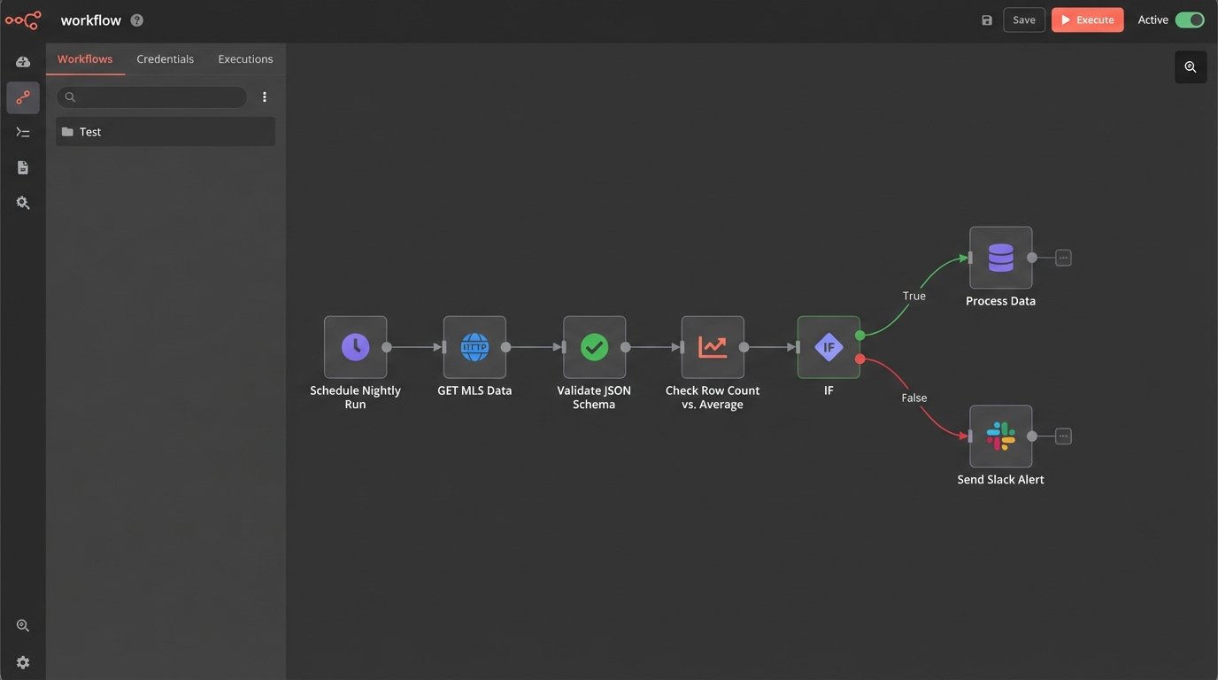
Automate Ingestion, but Manually Vet Anomaly Alerts
The pipeline that feeds your report must be automated. No one should be manually uploading CSVs. You set up scheduled jobs to pull data from the MLS, your CRM, and lead sources every hour or every night. That’s the easy part. The hard part is building a system that doesn’t silently import garbage data.
APIs fail. Data schemas change without warning. A field that used to be an integer suddenly contains strings. A robust pipeline needs defensive logic. You should build automated checks that validate the incoming data. For example, a simple script can check if the number of new listings is within a reasonable range. If it suddenly drops to zero or spikes by 500%, the script should halt the data import and fire off an alert.
These alerts should trigger a manual investigation. The temptation is to build automated “fixes,” but these often cause more damage, corrupting your dataset by trying to guess the correct data type or filling nulls with invalid defaults. A human needs to look at the raw data from the source, figure out what broke, and then manually re-trigger the import once the upstream issue is resolved or the script is patched.
Your automation’s job is to fetch the data and identify problems. A person’s job is to solve them.
Bypass Sluggish Native Connectors
Reporting tools love to advertise their long list of “native connectors.” These are pre-built integrations to popular platforms like Salesforce, Google Ads, and others. In practice, many of these connectors are slow, inflexible, and have cripplingly low API call limits. They are designed for simple use cases, not for pulling down the massive, complex datasets required for a serious real estate analytics operation.
The professional approach is to bypass these connectors entirely. Instead, use a dedicated script (Python is the common choice) or an ETL tool to extract the data directly from the source API. You then load this data into your own staging database. This could be a cloud data warehouse like BigQuery or Snowflake, or even a simple PostgreSQL instance. Your reporting tool then connects to your database, not the original source API.
This architecture gives you total control. You define the schema. You control the data transformation and cleaning logic. You can blend data from multiple sources before it ever reaches the dashboard. The reporting tool just becomes a dumb terminal for visualizing the clean, structured data you’ve prepared for it. This separation of concerns is critical for building a report that is both fast and reliable.
It adds another moving part to your system, and you are now responsible for maintaining that data pipeline. The payoff is performance and flexibility that a native connector can never offer.
The template is a starting sketch, not a blueprint. Your job is to erase most of it and draw a new architecture that reflects the ground truth of your data. A beautiful dashboard that shows the wrong numbers is worse than no dashboard at all. The goal is accuracy, then performance, then aesthetics, in that order.