
Forget the glossy marketing slicks. Most data visualization tools are either glorified chart-makers or enterprise-grade wallet-drainers that require a dedicated analyst to operate. The goal isn’t to create pretty pictures. The goal is to strip data from multiple listing services, county records, and economic indicators to pinpoint undervalued assets or forecast market saturation before anyone else does.
This is a breakdown of tools based on their raw capability to connect to messy real estate data and force it into a coherent, actionable format. We are not evaluating them on UI aesthetics. We are evaluating them on their ability to prevent you from making a multi-million dollar mistake based on a bad spreadsheet.
1. Tableau
Tableau is the industry heavyweight for a reason. It connects to almost anything, from a well-structured PostgreSQL database fed by your CRM to a folder of ugly, inconsistent CSV files exported from a legacy MLS system. Its primary function is to let you drag and drop dimensions and measures to rapidly build dashboards that correlate disparate data points.
Technical Benefits
The key function here is the live connection versus data extract option. A live connection to your data source means dashboards reflect changes in near real-time, but performance can be sluggish if the underlying database is slow. Using a Tableau Data Extract (.hyper file) pre-aggregates and compresses the data for speed, but requires scheduled refreshes. For tracking daily listing status changes, an extract refreshed every hour is usually the correct engineering choice.
Trying to join data from multiple MLS systems without a common property identifier is a classic failure point. Attempting to link these databases using something flimsy like a property address is like trying to sync two servers that are both using their own internal clocks. You get data drift, overlap, and eventually, a total system crash when an address is formatted differently.
Specific Use Case
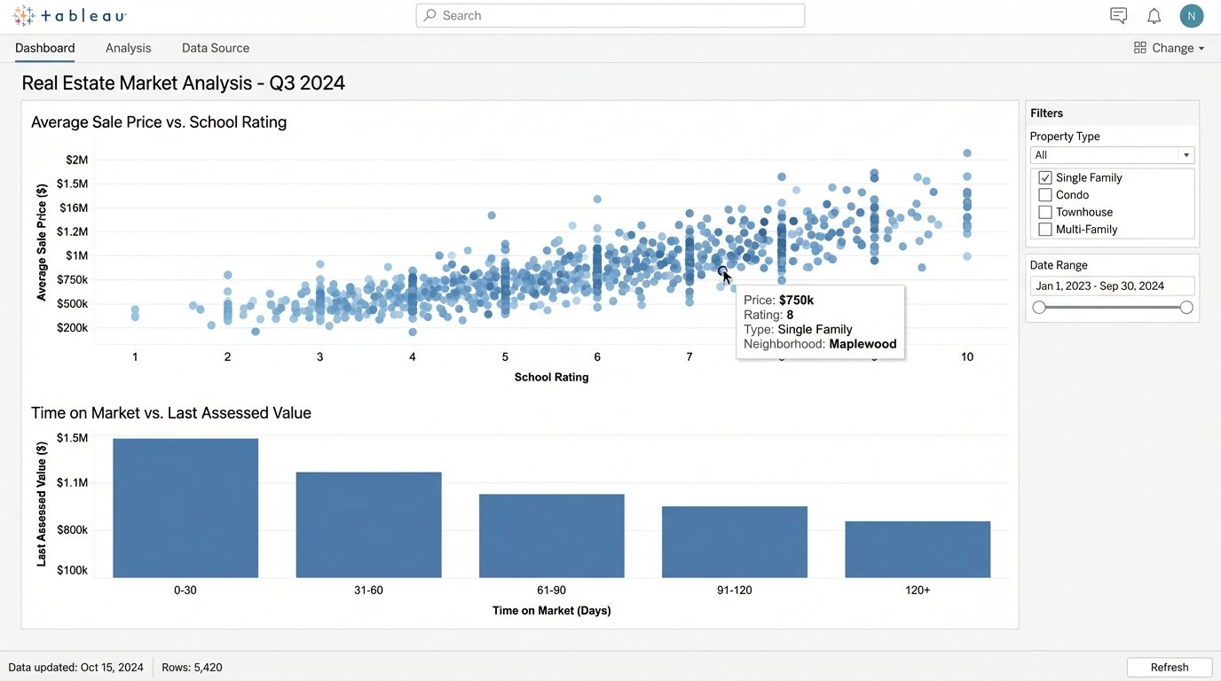
We connect Tableau directly to a feed from the National Association of Realtors’ Real Estate Transaction Standard (RETS). We then join that data with scraped school district rating data and county tax assessment records. This allows the creation of a dashboard that plots `Average Sale Price vs. School Rating` and `Time on Market vs. Last Assessed Value`. This immediately flags properties that are priced incorrectly relative to their two most critical external value drivers.
2. Microsoft Power BI
Power BI is Microsoft’s direct competitor to Tableau, and its main advantage is its deep integration with the Microsoft ecosystem. If your brokerage already runs on Office 365 and Azure, Power BI is the path of least resistance. It uses the DAX (Data Analysis Expressions) formula language, which feels like Excel formulas on steroids. It is not intuitive but it is powerful for creating complex calculated columns and measures.
Technical Benefits
Power Query, the data connection and transformation tool inside Power BI, is its real strength. It can ingest data from hundreds of sources and provides a UI for cleaning it. You can perform steps like splitting columns, unpivoting data, and merging queries without writing code. Every step is recorded and can be audited later, which is critical for debugging why your `Median Days on Market` calculation suddenly jumped 20%.
Specific Use Case
An agent wants to track their commission pipeline. We use Power Query to pull data from their CRM (like Salesforce) and their accounting software (like QuickBooks). In Power BI, we build a model that links deals by a unique ID. A DAX measure is written to calculate the projected commission based on deal stage and historical close rates. The result is a single dashboard showing cash flow forecasts, which is far more useful than the separate, siloed reports from the source systems.
Here’s a simple DAX formula to calculate a 90-day rolling average of sale prices. This smooths out market volatility.
AvgSalePrice90Day =
CALCULATE(
AVERAGE('Sales'[SalePrice]),
DATESINPERIOD(
'Sales'[Date],
LASTDATE('Sales'[Date]),
-90,
DAY
)
)
3. Looker Studio (formerly Google Data Studio)
Looker Studio is a web-based tool that is fast, free, and excellent for visualizing data that already lives within the Google ecosystem. It is not a data transformation powerhouse like Power BI or Tableau. Its job is to build and share simple, clean dashboards quickly. Expecting it to join ten messy spreadsheets is a recipe for failure. Its strength is presentation, not deep analysis.
Technical Benefits
The native connectors to Google Analytics, Google Sheets, and BigQuery are seamless. This makes it the default choice for visualizing real estate website traffic, lead sources, and digital ad campaign performance. The report sharing and embedding capabilities are simple and reliable. You build a report, you send a link, and it just works. No client software, no license management headaches.
Specific Use Case
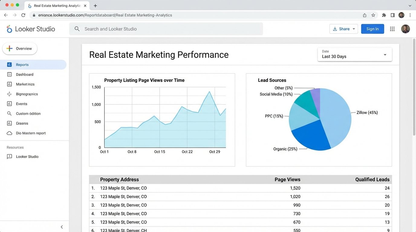
We hook Looker Studio up to the Google Analytics account for an agent’s website. We build a dashboard that tracks page views for individual property listings. We then blend this data with a Google Sheet where the agent manually inputs the lead source for every inquiry. This visualizes a direct line from digital engagement (e.g., a Zillow ad click) to a qualified lead, showing exactly which marketing channels provide actual value.
4. ArcGIS Online
This is not a business intelligence tool. It is a geographic information system (GIS). ArcGIS is for when your primary question is “where,” not just “what.” It’s built to handle geographic data types, projections, and spatial analysis at a level that business tools cannot touch. It is expensive and has a steep learning curve, but it is the correct tool for any location-based intelligence.
Technical Benefits
ArcGIS can perform spatial joins. This means you can join property data to another dataset based on physical location. For example, you can take a list of 10,000 properties and join it to a flood plain map layer to instantly identify every property with water risk. It also handles geocoding, turning messy street addresses into precise latitude and longitude coordinates, which is a constant problem with real estate data.
Specific Use Case
A developer is assessing land for a new subdivision. We load a shapefile of the city’s zoning regulations into ArcGIS Online. We then overlay a layer of all available land parcels for sale from the county assessor’s office. We run a spatial query to select only parcels that are larger than five acres, zoned for residential development, and are not within a designated wetland area. The output is a map of viable targets, a process that would take weeks to do manually with tax maps and spreadsheets.
5. PolicyMap
PolicyMap is a specialized, data-forward GIS tool designed for non-GIS experts. It comes pre-loaded with vast amounts of curated demographic, economic, and housing data from sources like the U.S. Census Bureau and the Home Mortgage Disclosure Act (HMDA) database. You are not just visualizing your own data. You are layering your data on top of thousands of established, clean datasets.
Technical Benefits
The primary benefit is the pre-cleaned, integrated data. The engineering work of acquiring, cleaning, and standardizing massive public datasets is already done. You can immediately start creating thematic maps showing things like median income, population density, or lending patterns without having to first build a data pipeline and ETL process. It bypasses a huge amount of grunt work.
Specific Use Case
A real estate investor is looking for emerging neighborhoods for a “buy and hold” strategy. Using PolicyMap, they can create a multi-layered map. Layer one shows census tracts where home values have increased by more than 10% in the last two years. Layer two filters for areas where the percentage of residents with a bachelor’s degree or higher is growing. Layer three adds data on new business permits. This pinpoints gentrifying areas based on real indicators, not just anecdotes.
6. Datawrapper
Sometimes you just need a clean, embeddable chart for your website or a client report, and you need it now. Datawrapper is a web-based tool that does one thing exceptionally well. It creates publication-quality charts and maps from simple datasets (like a CSV or a pasted-in spreadsheet). It is not for analysis. It is for communication.
Technical Benefits
The output is the benefit. The charts are responsive, interactive, and aesthetically clean by default. You do not need to fight with design settings. It produces a simple embed code (iframe or JavaScript) that can be dropped into any website or CMS. The maps are particularly strong for showing state-level or county-level statistics without the overhead of a full GIS system.
Specific Use Case
An agent writes a quarterly market report blog post. They have a simple spreadsheet with `Month`, `Median Sale Price`, and `Number of Sales` for the last quarter. They paste this data into Datawrapper, choose a line chart type, and the tool generates a clean, interactive visualization in about 90 seconds. They embed this chart directly into their blog post, providing a professional graphic that is far better than a static screenshot of an Excel chart.
7. Python (with Matplotlib & Seaborn)
This is the option for maximum control and automation. Using Python with libraries like Pandas for data manipulation, and Matplotlib or Seaborn for plotting, gives you complete power over the entire data pipeline. This is not a tool for the average agent, but for a brokerage’s data team. It’s the solution for custom, repeatable analyses that other tools cannot handle.
Technical Benefits
The entire process can be scripted. You can write a Python script that pulls data from an MLS API, cleans and reshapes it with Pandas, performs a statistical analysis (like a regression to find price drivers), and then saves the resulting plots as image files. This entire workflow can be scheduled to run automatically, providing daily updated market intelligence with zero manual intervention.
Specific Use Case
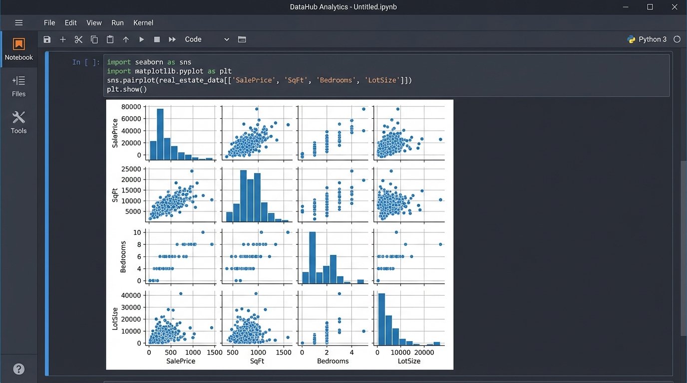
We need to analyze the relationship between `Sale Price`, `Square Footage`, `Number of Bedrooms`, and `Lot Size`. A simple chart cannot show this multi-dimensional relationship. We use Python to pull 5 years of sales data into a Pandas DataFrame. Then, we use the Seaborn library to generate a pair plot, which is a matrix of scatter plots showing the relationship between every variable. This single graphic can reveal non-linear relationships and data clusters that would be invisible in a standard dashboard.
import pandas as pd
import seaborn as sns
import matplotlib.pyplot as plt
# Assume 'mls_data.csv' has columns: SalePrice, SqFt, Bedrooms, LotSize
df = pd.read_csv('mls_data.csv')
# Logic-check for outliers and bad data
df = df[(df['SalePrice'] > 50000) & (df['SqFt'] > 500)]
# Generate the pair plot to visualize relationships
sns.pairplot(df, vars=['SalePrice', 'SqFt', 'Bedrooms', 'LotSize'])
plt.savefig('market_analysis_plot.png')
8. REscour
REscour is another specialized platform, but it is focused on commercial real estate (CRE). It aggregates data on development projects, transactions, and market trends. It is less of a pure visualization tool and more of a data aggregation and market intelligence platform that happens to use maps and charts as its primary interface. You use it to find information, not just visualize your own.
Technical Benefits
Its core value is the proprietary dataset. It tracks construction projects from proposal to completion, providing insight into future supply. This is forward-looking data that is difficult to gather from public records. The system links properties, companies, and projects, allowing you to trace relationships and identify the key players in a specific market.
Specific Use Case
A commercial broker is working with a client who wants to open a new retail store. The broker uses REscour to scan the target city for all retail development projects currently under construction. They can filter by square footage and expected completion date. This allows the broker to proactively contact landlords about leasing space in new developments before that space is even listed publicly, giving their client a first-mover advantage.