
Stop Building Dashboards on Top of Raw APIs
The first mistake everyone makes is pointing a BI tool directly at a collection of real estate APIs. You get a demo working in an afternoon, management is impressed, and you spend the next six months fighting rate limits, schema drift, and data normalization bugs. The Multiple Listing Service (MLS) ecosystem is not a clean, unified data source. It’s a patchwork of federated databases, each with its own quirks, running on protocols from different decades like RETS and the more modern RESO Web API.
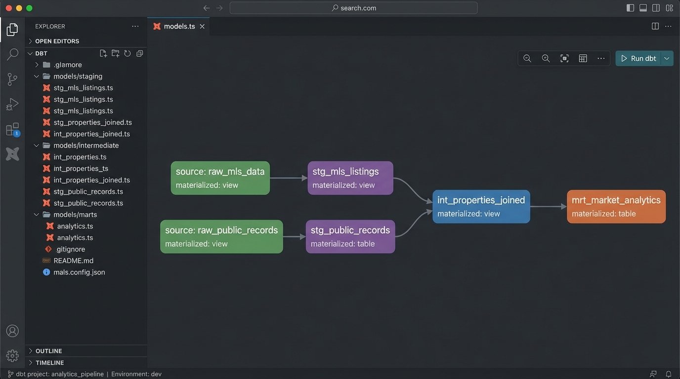
Your dashboard’s front end is the last 10% of the project. The first 90% is the plumbing. Get the plumbing wrong and the entire structure is unstable. You must build a separate data layer, a data warehouse or at least a staging database, to act as a buffer and a single source of truth. This layer ingests, cleans, and standardizes data before your dashboard ever touches it. It’s not optional.
Ingestion: The Art of Defensive Coding
Connecting to a RESO Web API endpoint sounds simple. You send a GET request and receive JSON. The reality is that these endpoints are often fragile, poorly documented, and have aggressive rate limits. Your ingestion scripts must be built with the expectation of failure. They need robust error handling, retry logic with exponential backoff, and comprehensive logging to diagnose why a specific MLS feed went dark at 2 AM.
The script’s job is to pull the raw data and dump it into a staging area with minimal transformation. We are not trying to model the data here. We are just getting it through the door. A simple Python script using `requests` and a retry decorator can handle this initial pull. The goal is to capture the raw payload, including all its warts, so you have a pristine copy before you start manipulating it.
This approach isolates the fragile external dependency. If an API changes a field name without notice, only the ingestion script breaks, not your entire analytics stack.
import requests

import time

from functools import wraps
def retry(tries=4, delay=3, backoff=2):
"""A simple retry decorator for network requests."""
def deco_retry(f):
@wraps(f)
def f_retry(*args, **kwargs):
mtries, mdelay = tries, delay
while mtries > 1:
try:
return f(*args, **kwargs)
except requests.exceptions.RequestException as e:
print(f"Request failed: {e}, retrying in {mdelay} seconds...")
time.sleep(mdelay)
mtries -= 1
mdelay *= backoff
return f(*args, **kwargs)
return f_retry
return deco_retry
@retry()
def fetch_mls_data(api_endpoint, auth_token):
headers = {'Authorization': f'Bearer {auth_token}'}
response = requests.get(api_endpoint, headers=headers, timeout=30)
response.raise_for_status() # Will raise an HTTPError for bad responses
return response.json()
# Usage
# listings = fetch_mls_data('https://api.some-mls-provider.com/v1/property', 'YOUR_TOKEN')
Architecture: Decouple or Die
A resilient real estate dashboard architecture has distinct, decoupled stages. Forcing one tool to do everything is a recipe for a sluggish, unmaintainable system. Think in terms of a pipeline: Ingestion -> Staging -> Transformation -> Presentation. The ingestion scripts we just discussed handle the first stage. They land raw, messy data in a staging database like PostgreSQL or a cloud object store.
The next critical stage is transformation. This is where you force the data into a clean, unified schema. Tools like dbt (Data Build Tool) are purpose-built for this. It allows you to write SQL-based transformations, test them, and document the lineage of your data. You can standardize column names, cast data types correctly, and join different data sources, like MLS data with county tax records.
Only after the data is cleaned and modeled should you connect your BI tool. Trying to perform complex joins and clean-up logic within the dashboard itself is like shoving a firehose through a needle. The BI tool should be responsible for visualization and simple aggregations, nothing more. Let the database do the heavy lifting.
Choose Your BI Tool Wisely
The BI tool market is full of wallet-drainers that promise the world but lock you into their ecosystem. Tools like Tableau and Power BI are powerful, but their per-user licensing costs can escalate quickly. They also encourage business users to build complex logic directly in the dashboard, which leads back to the maintenance nightmare we are trying to avoid.
Consider open-source alternatives like Apache Superset or Metabase. They are more than capable of producing the necessary visualizations. They connect to your data warehouse via a standard SQL interface, forcing you to maintain a clean separation of concerns. The learning curve might be a bit steeper for non-technical users, but the long-term architectural integrity is worth it.
Your choice of tool dictates your operational overhead. Don’t let a slick sales demo trap you in a technical dead end.
Metrics: Go Beyond “Number of Listings”
A dashboard showing only total listings or average sale price is useless noise. The value comes from calculated metrics that reveal market dynamics. These require joining and aggregating the clean data in your warehouse. You are looking for signals, not just raw numbers. Forget vanity metrics and focus on operational intelligence.
Here are a few metrics that actually provide insight:
- Absorption Rate: This measures how quickly available homes are selling. It’s calculated by dividing the number of homes sold in a month by the total number of available listings. A high absorption rate indicates a seller’s market.
- List-to-Sale Price Ratio (LSPR): The final sale price divided by the last list price. Tracking the average LSPR for a neighborhood shows whether properties are selling at, above, or below asking price. A sudden dip is a strong leading indicator of a market cooling off.
- Days on Market (DOM) Velocity: Don’t just track the average DOM. Track its rate of change. Is the average DOM for a zip code increasing or decreasing month over month? This shows if the market is speeding up or slowing down.
These metrics cannot be pulled from a single API call. They must be computed in your data warehouse. A SQL query for a basic LSPR calculation might look something like this, assuming you have a clean `properties` table.
SELECT

    EXTRACT(YEAR FROM sold_date) AS sale_year,

    EXTRACT(MONTH FROM sold_date) AS sale_month,

    zip_code,

    COUNT(*) AS number_of_sales,

    AVG(sale_price / list_price) * 100 AS avg_lspr_percent

FROM

    properties

WHERE

    status = 'Sold'

    AND sold_date >= '2023-01-01'

    AND list_price > 0 -- Avoid division by zero

GROUP BY

    1, 2, 3

ORDER BY

    1, 2, 3;
This is the kind of logic that belongs in your transformation layer, not hidden in a chart’s configuration settings.
Geospatial Data is Not an Afterthought
Real estate is fundamentally about location. A dot on a map is more powerful than a row in a table. However, address data from MLS feeds is notoriously inconsistent. You will get “123 Main St”, “123 Main Street”, and “123 Main St.” all for the same property. Before you can map anything, you must run all addresses through a standardization and normalization process.
Once standardized, you need to geocode them to get latitude and longitude coordinates. This can be expensive. Services like the Google Maps Geocoding API charge per request, and geocoding thousands of new listings a day adds up. You need a strategy to cache results and only geocode new or updated addresses. Never geocode the same address twice.
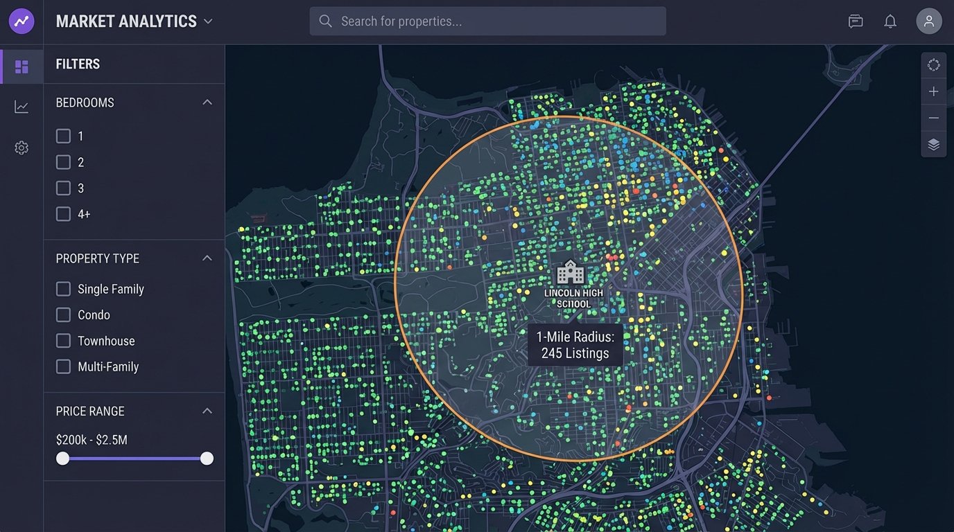
Storing this spatial data in a capable database is critical. PostgreSQL with the PostGIS extension is the industry standard for this. It turns your database into a powerful geospatial server, allowing you to run proximity queries that are impossible with standard SQL. An agent won’t ask for a list of properties. They will ask for “all 3-bedroom houses within a 1-mile radius of this specific school.” PostGIS makes that query efficient.
Performance, Caching, and Pre-Aggregation
A dashboard that takes 30 seconds to load is a dashboard nobody will use. As your data volume grows, running complex analytical queries on the fly will become a bottleneck. Users will click refresh, open multiple tabs, and effectively launch a denial-of-service attack on your database before their first coffee is finished.
The solution is to pre-aggregate data. Don’t wait for a user to request the average LSPR for a zip code for the last 12 months. Compute it ahead of time. Create materialized views in your database that store the results of your most common and expensive queries. The dashboard then queries these views, which is orders of magnitude faster than running the full calculation on the raw table.
The trade-off is data freshness. A materialized view might only be refreshed once an hour or once a day. You must have a conversation about how “real-time” the data actually needs to be. For strategic oversight, data that is a few hours old is perfectly acceptable. The quest for absolute real-time data for every metric is a costly engineering trap.
Alerting: Make the Dashboard Work for You
A dashboard should not be a passive tool that you have to remember to check. It should be an active monitoring system that alerts you to significant changes. Set up automated jobs that run queries against your key metrics and trigger alerts when they cross certain thresholds.
For example, you can set up a system to send an email or a Slack message if the average DOM in a key market increases by more than 15% in a week. This moves you from reactive analysis to proactive management. You are now using the data to spot trends as they emerge, not reading about them in a report a month later.
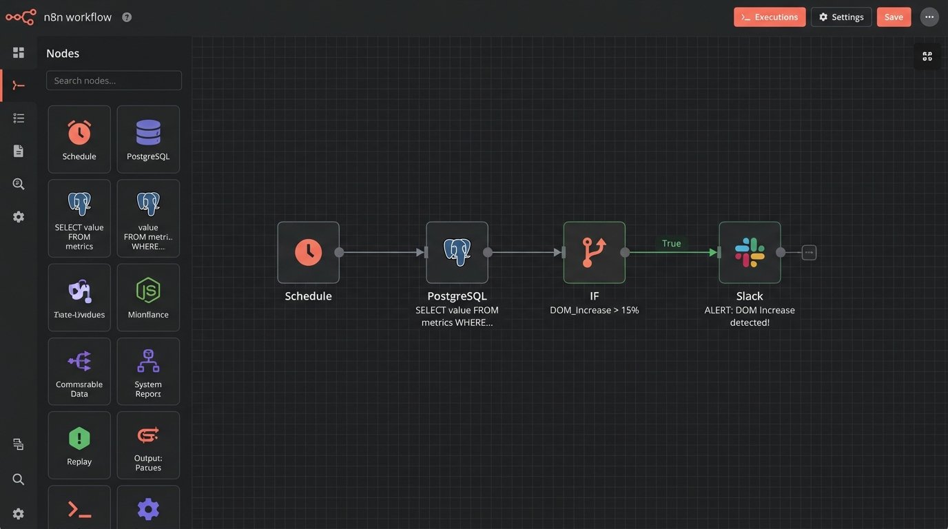
This alerting layer can be built with simple cron jobs running SQL scripts or more sophisticated workflow orchestration tools like Airflow. The mechanism doesn’t matter as much as the principle. Don’t rely on humans to constantly watch the charts. Automate the detection of anomalies and let the machines do the boring work.