
The Problem: Drowning in “Automation” Metrics
Management slides claimed a 70% automation rate. The reality was a 3 AM bridge call because a seven-year-old PowerShell script, running on a server under someone’s desk, finally fell over. The “adoption rate” metric was a fantasy, a number synthesized from vendor reports and project management software check-boxes. It had no connection to the stability of the production environment.
Our directive was to “increase automation.” A useless goal. The real problem was we couldn’t differentiate between a mission-critical ETL pipeline and a cron job that zipped log files. We were flying blind, celebrating the creation of new scripts while ignoring the technical debt rotting in the old ones. We had no unified view of what was running, where it was running, or how often it failed silently.
Before we could build anything new, we had to map the existing chaos.
Defining a Signal in the Noise
The first step was to create a rigid definition. We stripped the word “automation” of its ambiguity. A task was only considered “automated” for our purposes if it was non-interactive, scheduled or event-triggered, and performed a stateful operation on a production or pre-production system. This immediately disqualified a lot of developer convenience scripts and CI runners that only performed builds.
We needed a binary, system-agnostic way to track the lifecycle of these tasks. A simple heartbeat. Did it start? Did it finish? Did it succeed or fail? Everything else was noise. This wasn’t about performance monitoring. It was about existence and state validation.
The Architecture: A Glorified Log Collector We Actually Trusted
We evaluated off-the-shelf observability platforms. They were wallet-drainers, designed for microservices, not for wrangling a decade of disparate scripts. They required heavy agents, complex configuration, and licensing models that would choke our budget. The cost and complexity were inverted to the simplicity of the data we actually needed.
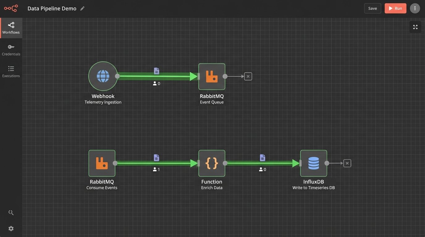
So we built our own. The architecture was primitive by design. A single, authenticated REST endpoint that accepted a JSON payload. That’s it. We forced the complexity onto the client scripts, not the central system. The goal was to make instrumentation so simple that an engineer had no excuse not to implement it.
Ingestion and Standardization
The core of the system was a non-negotiable JSON schema. Every instrumented script, whether Python, PowerShell, or a shell script wrapping a legacy binary, had to post to our endpoint on start and completion. The payload contained an automation ID, a hostname, a start or end timestamp, and a status code. Zero meant success. Anything else was a failure.
Getting teams to agree to this was the first major battle. We provided simple wrapper functions to make it a one-line addition. Here is the basic Python implementation we handed to application teams.
import requests

import socket

import uuid

import os
TELEMETRY_ENDPOINT = "https://telemetry.internal.corp/api/v1/event"
API_KEY = os.environ.get("AUTOMATION_API_KEY")
class AutomationTracker:
def __init__(self, automation_name):
self.automation_name = automation_name
self.hostname = socket.gethostname()
self.run_id = str(uuid.uuid4())
def _post(self, status, event_type):
payload = {
"automation_name": self.automation_name,
"run_id": self.run_id,
"hostname": self.hostname,
"status": status,
"event_type": event_type
}
headers = {"X-API-KEY": API_KEY}
try:
requests.post(TELEMETRY_ENDPOINT, json=payload, headers=headers, timeout=5)
except requests.exceptions.RequestException as e:
# Log to local file if telemetry endpoint is down.
print(f"Failed to send telemetry: {e}")
def start(self):
self._post(status="running", event_type="start")
def finish(self, status_code=0):
status = "success" if status_code == 0 else "failed"
self._post(status=status, event_type="end")
# --- USAGE ---
# tracker = AutomationTracker("daily_user_sync")
# tracker.start()
# try:
# # Main script logic here
# exit_code = 0
# except Exception:
# exit_code = 1
# finally:
# tracker.finish(exit_code)
The PowerShell version was functionally identical, just uglier. This standardization was critical. It allowed us to treat a 500-line Python script and a 20-line Bash script as the same logical unit from a tracking perspective.
Aggregation and Visualization
The API endpoint was a simple Flask app that did one thing. It validated the payload and API key, then shoved the JSON directly into a RabbitMQ queue. A separate consumer process read from the queue, did some minor data enrichment like adding geo-IP data based on the source server, and then wrote the structured data into an InfluxDB time-series database.
This decoupling was essential. If the database was slow or down for maintenance, the events would just queue up in RabbitMQ. It protected the ingestion endpoint, ensuring that instrumented scripts would never block or fail because our telemetry system was having a bad day. The entire backend was built for resilience against its own failures.
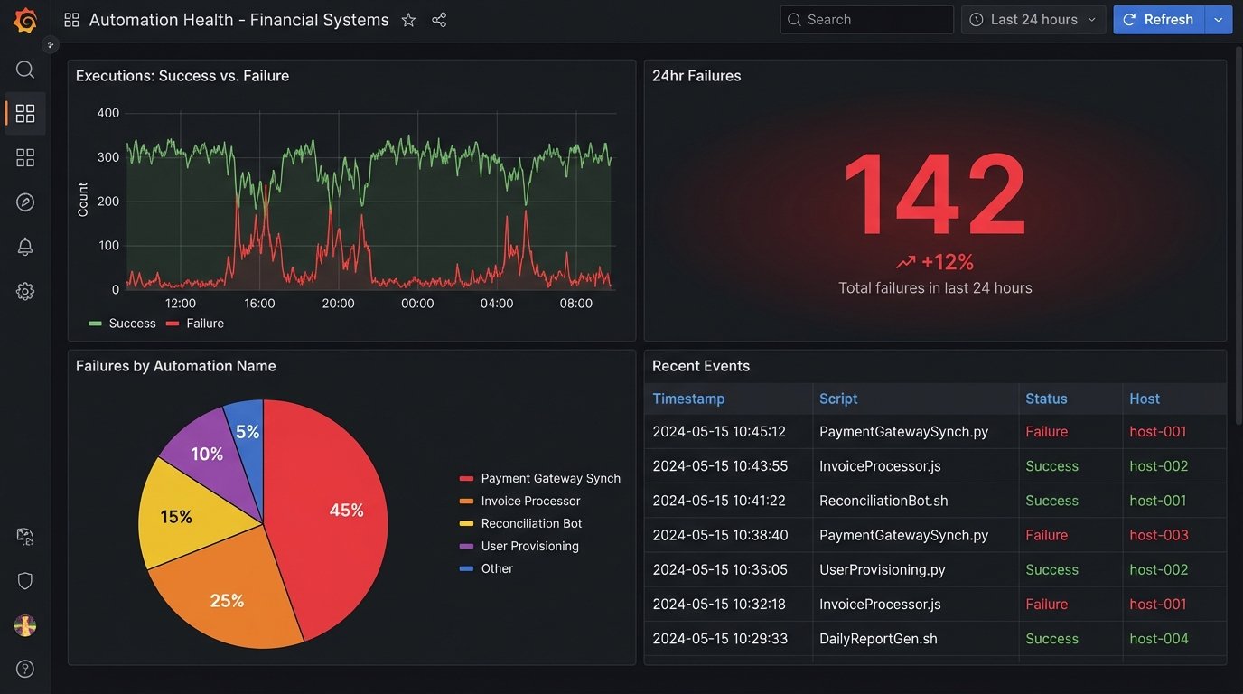
Grafana sat on top of InfluxDB. Within a week, we had dashboards. We could finally see the nationwide spread of automation executions in near real-time. We could filter by hostname, script name, or success status. The “70% automation rate” fantasy was immediately replaced by a very real, very ugly chart of nightly failures.
The Rollout: Herding Cats with Dashboards
A corporate mandate to “instrument your scripts” would have failed. Engineers ignore top-down directives that create more work without immediate benefit. Our strategy was different. We approached the lead engineers of the noisiest, most failure-prone teams first. We didn’t sell them on “visibility for management.” We sold them on “proof that your script failed because the database was down, not because your code is bad.”
We gave them their own dashboards. They could see their own failure rates before anyone else. This turned the tool from a corporate monitoring system into a personal diagnostic tool. Adoption followed. Once a few key teams were on board, the network effect took over. Teams without instrumentation looked primitive and unaccountable by comparison.
The Unexpected Findings
The data immediately invalidated years of assumptions. The trends were not what anyone in management expected. They were, however, exactly what every engineer who has ever been on call suspected.
Tool Sprawl and Shadow IT
We thought we had three primary automation platforms. The data revealed seventeen. We saw executions coming from Ansible Tower, Jenkins, and Control-M, but also from legacy Windows Task Scheduler nodes, user-managed crontabs, and a horrifying number of Python scripts running directly from user home directories on critical servers. The system became an unintended shadow IT discovery tool.
The “islands of automation” were stark. The SRE and cloud engineering teams had robust, well-instrumented jobs. The teams managing legacy financial systems, however, were running the company’s most critical reports via scripts that had no version control, no error handling, and no owner.
The Fragility of Dependencies
Our biggest discovery was that most automation failures were not caused by bad code. They were caused by fragile dependencies. The most common failure pattern was an API call to an external vendor timing out or hitting a rate limit. The second most common was a dependency on a network share that was unavailable during a backup window.
Mapping this nationwide felt like trying to find all the leaking pipes in a hundred-year-old building. Every time we fixed one script by adding retry logic, the telemetry would uncover three more that depended on the same shaky API endpoint. The data forced us to stop blaming individual scripts and start inspecting the foundational services everyone was using.
Quantifying Technical Debt
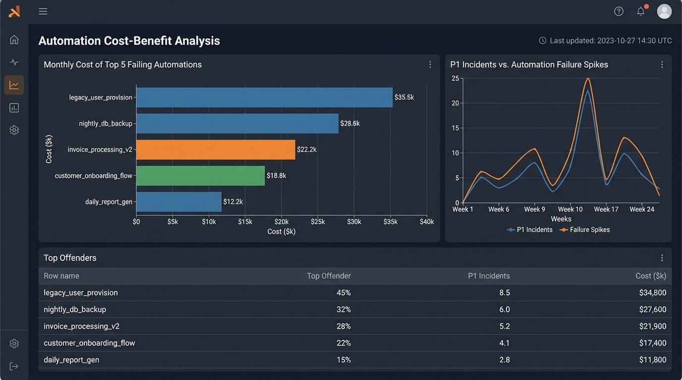
The telemetry data gave us something we never had before: a dollar amount for technical debt. We could now correlate a spike in automation failures with an increase in help desk tickets. We could show that a single, poorly written script that failed three times a week was costing 40 man-hours a month in manual cleanup.
This changed the conversation. Instead of asking for time to “refactor old code,” we could present a business case. “This script is costing us $8,000 a month in wasted engineering time. Give me one week to rebuild it, and that cost goes to zero.”
The Aftermath: What The Data Forced Us To Do
The project was a success not because we built a dashboard, but because the dashboard forced uncomfortable conversations. The data was irrefutable. It showed where the real risks were, and they weren’t where leadership thought they were. It forced a change in strategy from “build more automation” to “stabilize what we already have.”
We created a new internal team, an Automation Reliability Engineering group. Their job was to identify the most critical, most fragile automations identified by the telemetry system and systematically rebuild them on a modern, resilient platform. We decommissioned seven of the seventeen automation tools we discovered, forcing consolidation.
Final Numbers and Hard Lessons
Within six months of the system reaching 90% adoption, we saw a 40% reduction in P1 incidents attributed to automation failures. The mean time to resolution for the failures that still occurred dropped by half, because we knew exactly which script failed and why, instead of hunting through logs for hours.
The main lesson was simple. You cannot manage what you do not measure. The nationwide “automation adoption rate” was a vanity metric. The real indicators of health were failure rate, execution duration variance, and the number of distinct systems a single process had to touch. We stopped counting how many things we automated and started measuring how well they actually ran.